Donate2 Enhanced Donation Form
Donate2 Enhanced Donation Forms
A customizable donation form to meet your every need and more...
- Create super simple forms or more complex forms - you have the control
- We built and optimized this form type from the ground up
- Slightly wider and more beautiful format
- Improved One-Time and Recurring options
- Different amounts form One-Time and Recurring
- Unlimited Questions - Select from prebuilt options or build your own
- Special Activities
- Global form settings
- Form alias URL's for branding and marketing
- Form layout tool to organize the form content the way you want
- Company field is now part of Address Collection
- First time and recurring Message Manager transactional email receipts
- Expanded tokens and conditional content for the perfect Message Manager receipt
- So much more...

Create A Donate2 Enhanced Donation Form
When selecting a form type, you will see the Enhanced Donation form listed in the dropdown menu.

The Donate2 Enhanced Donation Form allows you to create fully customizable donation forms with unlimited questions. Everything can be edited to match your organization’s branding or specific purpose - Gifts, Memberships, Invoices and more.
When starting a new form, keep an eye out for these fun features:
- Lock/Unlocked - It's a very good practice to get into the habit of locking a form once you’re finished editing it. Please be aware that with Enhanced Donation Forms, when the form is locked, all collapsibles will be inaccessible and the editor will be greyed out. This is an update to how the other forms work. To make edits, unlock the form and you will have access to each collapsible section.
- Form Link - To view what your forms will look like on a larger screen than your Preview, utilize the Form link, Your Form link is the link you will use to share your form with the public.
We like to call each section of our menu a collapsible! Every form is customized by adjusting settings and content in our collapsible menus. The thirteen different collapsibles are:
Off-Sale - By Date or Count
Payment Options
Google Sheets
Enhanced Donation Editor changes are automatically saved as you work.
It is highly recommended to utilize the Presentation Manager feature. A Presentation Manager can be applied at any time by selecting a Presentation Manager from the drop down menu. A Presentation Manager can be removed at any time by selecting "None" from the drop down menu.
Form Settings

The Presentation Manager dropdown allows you to select a Presentation Manager from your 2Account and apply it to your form. If you click on the green box with the arrow, it will open the Presentation Manager in another tab so that you can quickly make edits. Once you've made the edits to your Presentation Manager, refresh your form editor and you will see them immediately attributed to the Presentation Manager on your form.
The Custom Domain allows you to create a truly unique and branded URL for your form
The Form Alias allows you to customize the URL to this specific form. If the alias name already exists, you will receive an error and will need to change the name to be unique. Clicking the green clipboard icon will copy the alias link so you can paste it where you wish. The form alias field is limited to 40 characters and must be characters that create a valid URL. The prepended section of the URL is created from your Account Information page from the settings in the Additional Setup section.
The Required Color, Rule Color, and Link Color are global settings that allow you to set the colors for required items (the background color that appears in required fields), the rules that you may choose (the line that separates sections), and link colors throughout your form. Each of these can be changed by clicking on the color box to the left of the text to choose a color from the color selector or by entering a hex code in the text box. You are also able to edit the color and opacity by clicking on the color square and utilizing the available sliders.
Form Layout

The Form Layout section allows you to customize your form even more than before! You are able to drag and drop each section up or down and individually decide where each section will live. For example, if you decided you wanted your Questions to appear before your Donation Frequency & Amounts, just drag the Questions section above the Donation Frequency & Amounts section. It's as easy as that!
The Form Layout elements are dynamically displayed based on if they the element is configured or not. If you inactivate an element (for example, if you decided you no longer wished to have a Goal Bar on your form), it will no longer appear on your form, and it will no longer display in the Form Layout tool. Be aware, as you sort elements in the Form Layout tool, hidden elements like your disabled Goal Bar may get sorted to the bottom of the Form Layout tool and when the element gets reactivated it may be at the bottom which seems odd, but is perfectly normal. You cannot remove the Donation Frequency & Amounts, Payment, or Totals sections.
You have the option to add Spacers or Rules between Form Layout elements. If you decide not to have one, click the red trash icon on the right hand side to delete it. If you decide to add a Spacer or a Rule between sections, hover your mouse over the Form Layout element. The Spacer or Rule option will appear (i.e. if you wish to add one of these between Marketing Opt-In and Cover Costs, hover your mouse over Marketing Opt-In element). You will see two green buttons appear on the right that allow you to pick either a Spacer or a Rule. Click on your desired choice.
Spacers default to 25px height and Rules default with 25px for top and bottom margin. These vales can be adjusted. Also, they have the drag and drop functionality, so if you wish to move one, you can do it just as easily as moving a section!
Off-Sale - By Date or Count

Header Image

If you have an image that you’d like to use, you are able to upload it in the Image section under the Header Image collapsible. Recommended image size is between 800 to 1000 pixels wide by 250 to 400 pixels tall at 72 dpi. The recommended format is PNG or JPG. When in doubt, check with your marketing department!
The Image Alt Tag allows you to add a short description for your image that is accessible to screen readers or shows as text if the image doesn’t load.
Main Content

- Please note - Within the body of your text, you can include inline HTML and CSS to additionally style.
- If your goal is to receive a certain number of gifts, you can utilize this option (the number can be edited in the Starting Amount text box). The Bar and Text colors can be edited based on your branding by utilizing the color editor or entering a hex code in the text box.
- If you are generating donations outside of your Donate2 Enhanced Donation Form (via the phone, website, checks, etc.) you can use the Starting Amount and Starting Date to account for additional sources of donations. Once you know the current amount raised (after pulling a report in Tessitura), you can enter that amount into the Starting Amount field. You can then set the Starting Date to the day from which your Donate2 donations will count towards this campaign. Most likely, that will be the day you update the Starting Amount.
- If your goal is to receive a certain amount in gifts, you can utilize this option (the goal number can be edited in the Starting Amount text box). The Bar and Text colors can be edited based on your branding by utilizing the color editor or entering a hex code in the text box.
- If you are generating donations outside of your Donate2 Enhanced Donation Form (via the phone, website, checks, etc.) you can use the Starting Amount and Starting Date to account for additional sources of donations. Once you know the current amount raised (after pulling a report in Tessitura), you can enter that amount into the Starting Amount field. You can then set the Starting Date to the day from which your Donate2 donations will count towards this campaign. Most likely, that will be the day you update the Starting Amount.
The Fine Print section is an editable text box that allows you to add purchase information or legal information if you choose. This text color can be changed by using the color editor under the Fine Print Color or by entering a hex code in the text box. If you include a link in your fine print, the global settings above will ensure that the color matches whatever color is chosen. If you elect to have no fine print on your form, you can leave this section blank.
Donation Frequency & Amounts

The Style drop down allows you set of the options appear as Buttons or Dropdowns
The Frequency One-Time Toggle Text and the Frequency Recurring Toggle Text are editable text boxes that allow you to customize the text on the respective toggle buttons. The default text for these options in any new form will be "One-Time" and "Recurring" respectively.
The Button Active Color and Button Inactive Color allow you to customize the color of each toggle option via a hex code or the color editor. In the example above, when One-Time is selected, the button color will be red and the Recurring will be white. If you were to select Recurring instead, that option will then be red and the One-Time option will be white.
The Frequency One-Time Instructions and Frequency Recurring Instructions are both editable text boxes that allow you to change the copy that appears when the respective option is chosen. In the example above, when the One-Time option is selected, the following text is viewable under that option: "Choose a One-Time donation amount:" These can be edited with CSS styling or additional tokens. For more information about tokens, please click here. Additionally, to better understand how recurring gifts are managed in Stripe, click here.
Both Instruction Text Colors can be edited in using the color editor or by entering a hex code in the respective text boxes.
Button Layout is either Grid for Flex. Flex will resize the buttons and Grid provides a 1, 2, or 3 column format.
The Frequency Label Text appears when the recurring option is selected. This text appears over a drop down menu that lists the frequency options that you can select at your discretion. This is an editable text box where you can change this copy should you so choose. The Frequency Label Text Color can be changed using the color editor or by entering a hex code in the available text box.
The Frequency Options is a drop down menu where you can select the frequency options you wish to display on your form. Options are Weekly, Monthly, Quarterly, Semi-Annual, and Annual. You can select no frequency options, one option frequency options or multiple frequency options.
The Include Other Field is a drop down option that can be enabled or disabled. If enabled, a text box will appear on your form where your customer can enter an amount that is not already available on your form.
The Other Minimum Amount allows you to set a minimum amount that can be entered in the Other field. In the example above, the minimum is set to $2. If your patron enters $1, they will receive a notice that tells them that the minimum amount that can be entered is $2.
The Pricing Amounts section allows you to enter the financial amounts for each frequency type that will appear on your form whether the One-Time option or Recurring option is selected. The amounts you enter for One-Time, Monthly, and Annually can all be different. Enter the amount into the available text box and then click the "Add Amount" button. Once the amounts are entered, their order can be changed by dragging and dropping the selections into the order you wish. You can delete a selection by clicking the red trash icon on the right side. Hovering in a selection also gives you the option to set that selection as the default on your form. The amount set as the default is the financial amount that is initially presented on the form.


Upon entering an amount, you are able to add labels in this section as well, if you so choose. An example of this would be if you had certain dollar amounts that equal a "level" within your organization, you are able to add the title of that amount into the Amount Label text box. (i.e. If a customer gives $100 and by giving that amount, they reach Encore level, you're able to label the $100 amount as "Encore").
To edit an amount or corresponding label, click the grey pencil or edit icon. Once you have made your changes,
The Which Fund/ On Account Option is an editable text box that allows you to change the copy that appears when multiple funds are selected to which this donation can be applied. If no additional fund is selected, this option will not appear. You are also able to change this text color in the Option Text Color by using the color selector or entering a hex code in the text box.
The Include Frequency Text can be enabled or disabled by selecting "Yes" or "No" from the drop down menu. The frequency text will be One-Time, Weekly, Monthly, Quarterly, Semi- Annual, and Annual. This copy will be prepended on the total line of the Enhanced Donation Form. For example: One-Time Donation or Quarterly Donation or Annual Donation.
The Payment Line Text is an editable text box that allows you to enter whatever you wish to call these contributions (i.e. Gift, Donation, Contribution, etc.). An example of this would be if someone where to select the One-Time option of $250 and. the payment line text were set to Gift, at the total amount, you will see "One-Time Gift $250.00." The Payment Line Text Color can be edited by using the color editor or by entering a hex code in the text box.
Payment Options

The Payment Options Label provides the ability to title the payment section of your form.
Additional Payment Options allows you to select what payment options you want to present to the patron. Credit Card, Google Pay and Apple Pay are always supported. Addditional forms of payment include ACH, Affirm, Klarna, Link, Cash App, and Amazon Pay.

Highlight color will stye the Payment Options depending on how your options are configured.
Payment Button Layout is for formatting how you want the Payment Options to look. Your options include Tabs, Accordion with Radio Buttons and Accordion without Radio buttons.
Exclusive Payment Option - This would be used in an Amex exclusive sale or this could require a transaction to be a debit not a credit transaction.
Enhanced Questions

The Enhanced Questions section of this form allows you to utilize preset questions to display on your form or to build your own. Clicking into the dropdown menu in this section will show you both the available questions that are already configured as well as give you style options to create your own.
The Build-Your-Own options are:
——————————————————
- Special Activity
——————————————————
- Checkbox
- Checkbox with Input
- Checkbox with Radio and Input
- Dropdown
- Radio
- Radio with Input
- Input
- Text Area
- Date/Time
- Title/Rule
——————————————————
The pre-built options are:
- Remain anonymous
- Fully Tax Deductible
- Wish to be Acknowledged
- Employer Match
- Other Notes or Requests
- Honor or Memory
- Birthday
——————————————————
An example of a pre-built question:
Each questions now contain a JSON Key (Optional) to provide a key that maps to the response in the Tessitura CSI.


To change the name of your button, click on the pencil icon next to the current name. This will open a text box where you can add your own name. Once you've decided on the text you'd like to include, click the green save icon.
The Checkbox Color allows you to change the color of the checkbox that appears next to your question. This can be done by clicking the color box and selecting a color from the color editor or by entering a hex code in the text box.
Initial State gives you the option to have the checkbox checked or unchecked when the form is loaded. Leaving it Unchecked allows your customer to check the box on their own where having it Checked means the checkbox will be checked initially and your customer can un-check it if they so choose.
Label Text is an editable text box that allows you to change the text of the question. In the example above, this Honor or Memory question defaults to "I/We would like to dedicate this donation in honor or in memory of someone." You can change the color of this text by utilizing the color box in Label Text Color or by entering a hex code in the text box.
In the Radio section, the Label Text is an editable text box that allows you to change the text that will appear between the checkbox text and the radio button text. In the example above, this box has been left blank, therefore, nothing will appear on your form. If you do decide to have additional text in this box, you can edit the color of this text in the Label Text Color by clicking on the color box and selecting a color from the editor or by entering a hex code in the text box.
The Radio Orientation is a dropdown menu that allows you to select Vertical or Horizontal. If you select Vertical, the radio options will stack on top of each other in a list form. If Horizontal is selected, your radio options will appear side by side if the character limits are not reached for each option. If character limits are reached, the radio options will appear on top of one another.
The color of your radio button can be changed in the Radio Color section by selecting a color in the color editor or by entering a hex code in the text box.
The color of your radio button text can be changed in the Radio Text Color section by selecting a color in the color editor or by entering a hex code in the text box.
In the pre-built option above, there are only two radio options available. The text of each of these options can be edited in their respective Radio Option Text boxes. If you choose to add additional radio options, you can do so by clicking on the "+ Add Radio Option" button in this section.
The Input section is where you can edit the information that will be where your customer enters information on your form. If this question is checked on your form, the radio buttons and the input section appear.
The Label Text is an editable text box that allows you to change the text that appears above the input box on your form. In this pre-built option, it defaults to "Honoree’s Name," but can be changed if you so choose. The color of this text can be changed by clicking into the color editor or by entering a hex code in the Label Text Color field.
The Placeholder Text is what appears in the input field before your customer enters anything. This is an editable text box that allows you to change the copy in this section if you so choose. In this pre-built option, this section defaults to "Enter the honoree’s name." The color of this text can be changed by clicking into the color editor or by entering a hex code in the Placeholder Text Color field.
The Placeholder Style is a dropdown menu that allows you to choose the behavior of the placeholder text once your customer clicks into this field. Floating Label moves the placeholder text to the upper part of the input section allowing it to still be seen once your customer begins entering information. Traditional keeps the placeholder text in place until your customer begins entering information.
The Required option is a dropdown menu that allows you to choose whether this question and input are Required or Not Required in order to submit the form. The pre-built example above defaults to Not Required.
The Validation option is available for Input Fields. The validation options are:
- None (No Validation)
- Numeric (Numbers Only)
- Email (valid Email Address)
The JSON/TEXT toggle will change the format of the answers saved into the Tessitura CSI. If you select Text, it will provide nice easy to read text format. If you choose JSON, a JSON data structure is saved allowing you to easily parse the responses using predictable keys.
Here is an example:
{"order_no":102664,"email":"Stephen@lynch2.com","attendee1name":"Stephen Lynch","attendee1org":"L2 Interactive","acessibilityrequirements":"None","dietaryrestrictions":"Gluten Free","comments":"We will be arriving the day before"}
The default Customer Service Issue settings will use the same as you have set up in your Tessitura Live General Purpose CSI. To use specific CSI settings for your form, you can create a new Tessitura Contact Method (if needed) Tessitura Activity Type (will be needed) and Tessitura Origin (if needed). Select the appropriate options for Contact Method, Activity Type, and Origin for your form. When the form is processed, the Questions feature will provide the questions and answers in the CSI configured.
Generate an Email allows you to set comma-separated email addresses to which the question responses will be sent upon the completion of the form. An example of this would be including a development officer or department email listed in this section and having a question asking your customer to enter information about a gift that is in honor of someone. Once your customer submits their donation with that information, an email with a copy of the question and response will then be sent to that development officer or department as well as included in the CSI information in Tessitura.
An example of a build-your-own question:

The Date/Time option is a great option if you need to figure out a good time to reach a donor or a similar situation.
The Label Text is an editable text box that allows you to enter your desired question or text. This section defaults to "Date & Time Label Text." You can edit this text color by clicking the color editor under Label Text Color or by entering a hex code in the text box.
The Date/Time Style is a dropdown menu that allows you to select a Date only (which allows your customer to select a date via a calendar option on the form), a Time only (which allows your customer to select a time by clicking on the clock icon on your form), or a Date/Time combination (which gives your customer both options to edit on your form). This section defaults to Date.
You are able to make this a required question by selecting Required or Not Required in the dropdown menu under Required.
The Input, Text Area, and Title/Rule options in the build-your-own selections are able to be connected to other build-your-own question options. These are the only three options that can be connected to other questions. There is a dropdown option within these question types that allow you to connect to an individual question.
Donor Address

The default setting for Overwrite Address is set to No. This means it will not overwrite an address connected to an account that matches a patron’s email address. If this is set to “Yes,” the address can be overwritten in Tessitura. Use this option carefully.
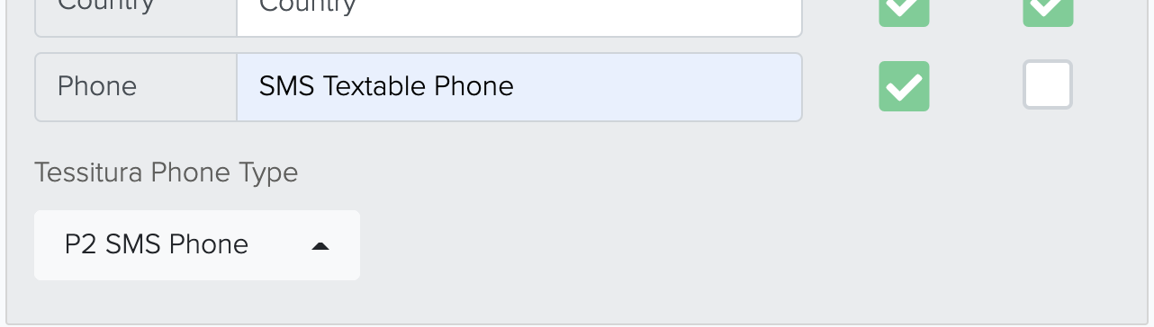
If any of the above options are enabled, they will be displayed on your form. If they are set to "Required," an asterisk will be appended to the label along with the Required color from the Form Settings section will be applied to the fields and the payment cannot be processed until it is filled out by your patron.
Keep in mind that the USPS says that an address with a unit number should be combined onto the same line. With the settings above, if a customer were to enter their information like this:
Address Line 1 - 792 West Bartlett Road
Address Line 2 - Unit 792
It will appear in Tessitura like this:
Street 1 - 792 West Bartlett Road Unit 792
If a Company name is added to the address information like this:
Company - L2
Address Line 1 - 792 West Bartlett Road
Address Line 2 - Unit 792
It will appear as this:
Street 1 - 792 West Bartlett Road Unit 792
Street 2 - L2
Within Tessitura, it will appear in the constituency record like this:

Marketing Opt-In

- If your 2Account is integrated with Prospect2, this option will be available via the dropdown menu and settings can be adjusted in the Prospect2 integration.
- If you are not integrated with Prospect2, you should only have the option of "Contact Permissions." which will add this information to the patron’s Tessitura account.
- Utilize the "None" option if you do not want the Marketing Opt-In checkbox available on your form.
Cover Costs

- "Yes" places a checkbox on the form giving the patron the option to cover the costs. They must select the checkbox if they want to cover costs.
- "Yes (Default Selected)" places a pre-selected checkbox on the form where the patron must unselect the checkbox to opt-out of covering the costs;
- "No" will remove the check box from the form completely.
Thank You

Social Sharing Previews

Social Sharing Previews does not share or post the form to social media on your behalf. This is a tool to configure the preview and analytics when you or your patrons choose to share the form.
Here is an example of what the preview looks like when the link is shared on social media.

Tessitura

Messages

Messaging allows you to select an email option from your Message Manager via the drop down menus. You are able to utilize one, two, or all three of these options, or none at all. This email will be sent out when the transaction is completed ( Time of Initial Donation), following a recurring payment (Time of Recurring Donation), or when a new account is created in Tessitura (Tessitura Account Created) and can be designed or branded to your liking. For more information about the Message Manager, please click here