Presentation Manager
The Presentation Manager allows you to create branded page templates for your forms. This helps you create a consistent brand experience anywhere a customer interacts. Presentation Manager templates can be applied when presenting the following to your customers:
- Donate2 Donation Forms
- Stream2 Forms
- Flex2 Forms
- Customer Portal Manager - Manage Recurring Payments
- Brightcove Login, Player, Watch Now
Presentation Manager Templates cannot be applied to Team Fundraising Forms. Team Fundraising has its own presentation format.
The Presentation Manager navigation is located in the drop down menu at the top right corner of your screen:

The Presentation Manager is available to the following user types:
- Owner
- Admin
- Builder
Presentation Manager
The Presentation Manager lists the templates you have created.

+ Add New
Using the +Add New button, you can create a new template. Creating a new template will default with standard settings as a starting point. You can update and customize the template.
Clone
You can clone a complete templates for an exact duplicate.
Delete
If you attempt to delete a Presentation Manager that is in use on one or more forms you will be notified and will not be able to delete the Presentation Manager.

Clicking into the Presentation Manager you wish to edit will bring you to this screen:

Scripts & Styles
In the Scripts & Style section of the Presentation Manager, you can include your own custom CSS and JavaScript to change the look and style of the forms that are used with your Presentation Manager. Visit the Presentation Manager Scripts & Styles Sample Code help article for sample advanced CSS.

Top Bar

In the Top Bar section of the Presentation Manager, you can upload an image with your logo for the top bar of the form page, and you can select the image positioning from the dropdown. The Image Height field is used to control the size of the Top Bar Image. In addition, you can select a background color for the top bar using the color picker.
Background
 In the Background section of the Presentation Manager, you can upload a Background Image to display on the page behind the form. You also have the ability to add a Background Top Color and Background Bottom Color overlay color. By manipulating the color and opacity settings in the color picker, you can create an attractive gradient as that can be previewed using the Preview Form feature.
Footer
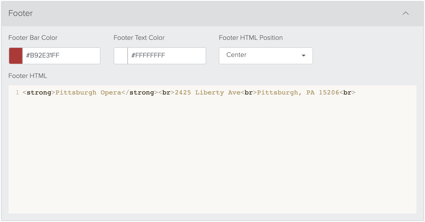

In the Footer section of the Presentation Manager, you can add footer text using the HTML editor, and then you can select the Footer Bar Color, Footer Text Color, and Footer HTML Position (i.e. text alignment).
Legal Bar
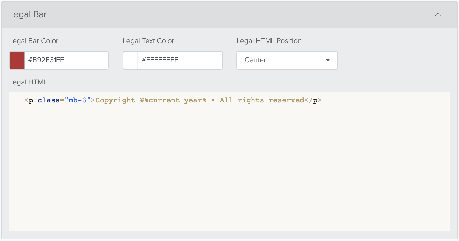

In the Legal Bar section of the Presentation Manager, you can add legal text using the HTML editor, and then you can select the Legal Bar Color, Legal Text Color, and Legal HTML Position (i.e. text alignment). We support the token %current_year% in the HTML field so that you do not have to update the year every year.
Brightcove
The Brightcove section in the Presentation manager is used for organizations that have their Brightcove Integration configured.

The Logo section is where you can upload a logo that will appear at the top of the login modal used to authenticate with your CRM. You can use a Background Color to place a color behind the logo. It can be changed by clicking the color box to the left of the text box or entering a hex code within the available text box. This can be effective if you are using a transparent .png for the logo.
Typically, if you are using a logo in the Top Bar Image shown above, you would leave this logo blank so you didn't have 2 logos displaying on the screen.
Login Form
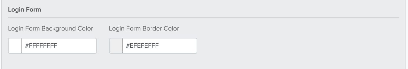

The Login Form Background Color and Login Form Border Color can be changed by clicking the color box to the left of the text box or entering a hex code within the available text boxes. These are the colors that will appear in the login section when your customer attempts to access your Brightcove item.
Header
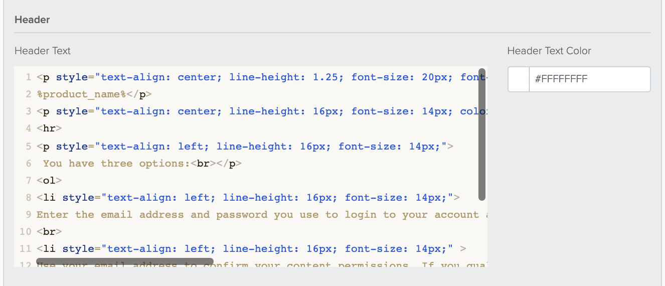

In the Header section, you can add CSS styling using the editor for full control of the content and styling. To keep it simpler, you can add text into the Header Text field and you can select a Header Text Color by clicking on the color box or entering a hex code in the text box. This is the text that will appear on the screen when your customer attempts to access your Brightcove item.
Username and Password Fields
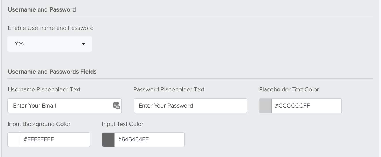

The Username and Password can be enabled or disabled via the dropdown menu available. If enabled:
The Username Placeholder Text and Password Placeholder Text are editable text boxes that allow you to change the text within each of these fields should you wish to do so. The defaults are set as seen below; however, should you delete the text and leave the text box blank, the form will default to "Username" and "Password" in the respective text boxes at login.
The Placeholder Text Color, Input Background Color, and Input Text Color each have a color box to the left of their respective text boxes that allow you to choose a color by pointing and clicking within a color gradient or via entering a hex code in the text boxes.
Login Button
The Login Button Text is an editable text box that allows you to change the text seen on the login button in the login screen. The default is set to "Login" if you do not wish to change it.
The Login Button Color and Login Button Text Color allow you to choose a color by clicking on the color boxes to the left of the respective text boxes or by entering a hex code into said text boxes. These change the colors of the login button only.

Forgot Password Option
 The Forgot Password Option can be enabled or disabled via the dropdown menu available. If enabled:
The Forgot Password Link Text is an editable text box that allows you to change the text seen at login should your customer need to reset their password. The default is set to "Forgot Password."
The Forgot Password Link Color can be changed by clicking on the color box to the left of the text box and selecting a color in the color editor or by entering a hex code in the text box.
The Forgot Password Link is what redirects your customer should they click on this option and need to reset their password. Most organizations redirect to the same screen that a customer would see if they were to select a Forgot Password option on their website.
TNew Users: Here is what you add to your TNEW website URL to cause the Forgot Password to activate: ?forgot=true
Divider Rule
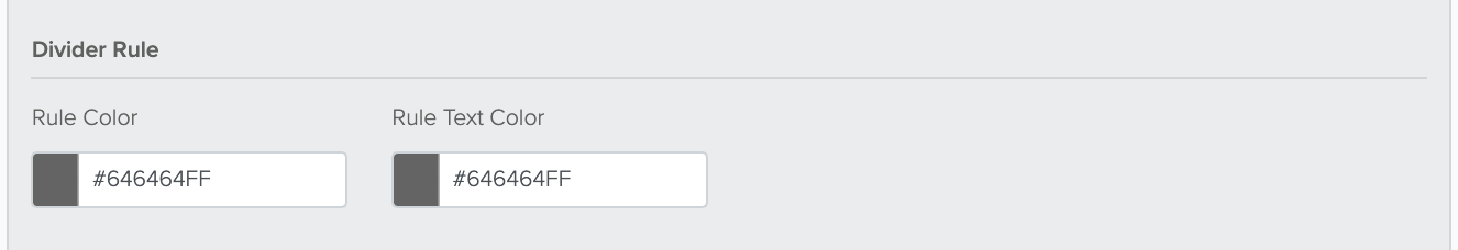

This allows you to change the color of the rule and the color of the text that is seen between the Login button and the other available buttons on the screen. The Rule Color and Rule Text Color are able to be changed by clicking on the color box on the left and selecting from the color editor or by entering a hex code in the text box.
Pop-up Window
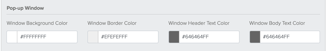

The Pop-up Window option is the window that will open should your customer choose either authentication option detailed below. These settings will be the same should your customer select either option. The Window Background Color, Window Border Color, Window Header Text Color, and Window Body Text Color are all editable color sections either by clicking on the color box to the left of the text box or by entering a hex code in the text box.
Passcode Options
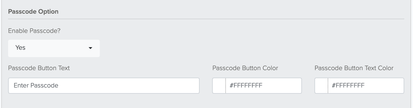

The Passcode Option can be enabled or disabled via the dropdown menu. If enabled:
The Passcode Button Text is an editable text box that allows you to add your own text that is viewable on the Passcode button on the login screen. The default is set to "Enter Passcode."
The Passcode Button Color and Passcode Button Text Color are each editable color options either by clicking on the color box to the left of the text box or by entering a hex code in the text box.
These options only apply to the Passcode button option.
Validate Passcode Button
The Validate Passcode Button Text allows you to change the text and color of the button that your customer would click to validate their passcode option.
The Validate Passcode Button Color and Validate Passcode Button Text Color are each editable color options either by clicking on the color box to the left of the text box or by entering a hex code within the text box.
This option is only applicable to the Passcode verification process.

Email Authentication Option
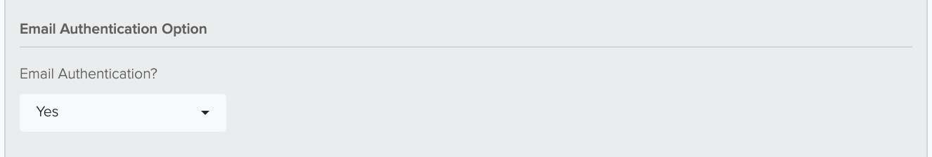

The Email Authentication Option can be enabled or disabled via the dropdown menu.
Email Authentication Buttons
If the Email Authentication Option is enabled:
 The Email Authentication Button Text allows you to change the text that is viewable on the login screen. The default is set to "Authenticate with Email."
The Email Auth Button Color and Email Auth Button Text Color allow you to change the colors of the Email Authentication Button either by clicking the color box to the left of the text box or by entering a hex code into the text box.
Email Authentication Fields
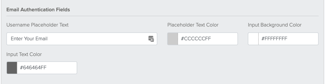

The Username Placeholder Text allows you to edit the text that is see in the pop up window text box once your customer clicks on the Authenticate with Email button. The default is set to "Enter Your Email."
The Placeholder Text Color, Input Background Color, and Input Text Color allow you to change the colors viewable in the text box within the pop up window. Either of these can be changed by clicking on the color box to the left of the text box or by entering a hex code within the text box.
Send Button
 The Send Button Text allows you to change the text and color of the button that your customer would click to validate their email verification option.
The Send Button Color and Send Button Text Color are each editable color options either by clicking the color box to the left of the text box or entering a hex code within the text box. These will change the colors of the button available on the verification pop up window.
Verify Button
 The Verify Button Color and Verify Button Text Color allow you to change the color options of the button available on the screen when your customer enters their verification code.
This option is only applicable to the Email verification process.
Watch Now
 In the Watch Now section, you can add CSS styling using the editor for full control of the content and styling. To keep it simpler, you can add text into the Watch Now Text field and you can select a Watch Now Text Color by clicking on the color box or entering a hex code in the text box. This is the text that will appear on the screen after purchase or login verification when Watch Now is activated.
The Watch Now Button Text allows you to change the text that is viewable on the respective button. Example: I'm ready to Watch Now
The Watch Now Button Color and Watch Now Button Text Color allow you to change the color of each part of this button by either clicking on the color square to the left of the text box or by entering a hex code in the text box.
Watch Later
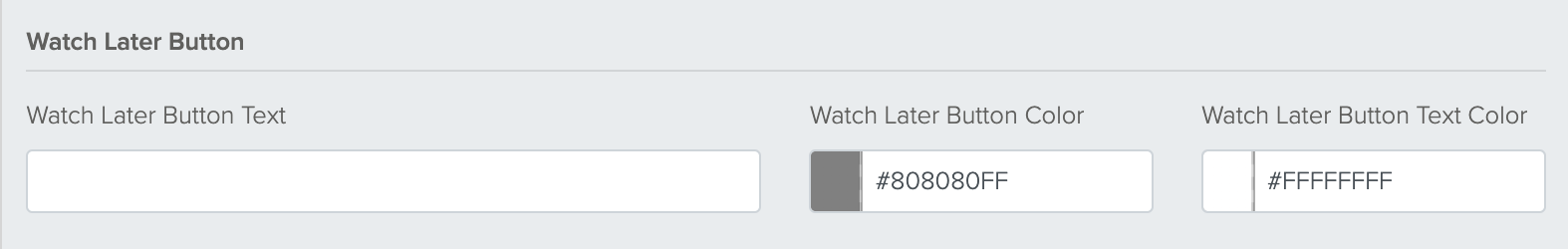

The Watch Later Button Text allows you to change the text that is viewable on the respective button. Example: I'd rather Watch Later
The Watch Later Button Color and Watch Later Button Text Color allow you to change the color of each part of this button by either clicking on the color square to the left of the text box or by entering a hex code in the text box.
Watch Later Behavior
The Watch Later Behavior option allows you to do one of two things should your customer select the Watch Later option:
Redirect to Login sends your customer back to the login screen.

Display Message will show a custom message that you can configure in the HTML editor that appears when this option is selected.

Preview Options
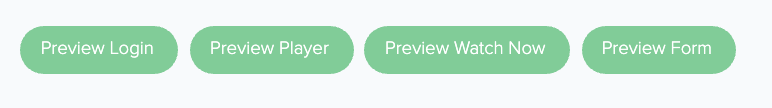

The Preview Options are a selection of buttons at the bottom of your screen that allow you to preview each of the respective sections of your Presentation Manager.
Preview Login allows you to preview the Presentation Manager as it would be viewed from the login screen that your customer would see should they need to log in with an email and password or should they need to verify their information.
Preview Player allows you to preview the Presentation Manager from where your Brightcove item might play.
Preview Watch Now allows you to preview the Presentation Manager as it would be viewed when this option is selected.
Preview Form allows you to preview the Presentation Manager as it would be viewed with a form. When you click on "Preview Form," a window pops up allowing you to select a from within your 2Account to which to apply this presentation manager, so you have the capability to view this presentation manager on Donate2 Donation forms, Enhanced Donation Forms, Flex forms, etc. This is for preview purposes only. To apply a template to your actual form, go to the Form Editor and use the Templates collapsable.
Additional Examples:
Preview Login

Preview Player

Preview Watch Now

Preview Form
