Digital Membership Cards


1. Enable/Disable
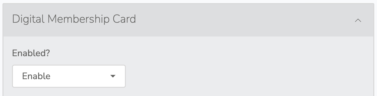
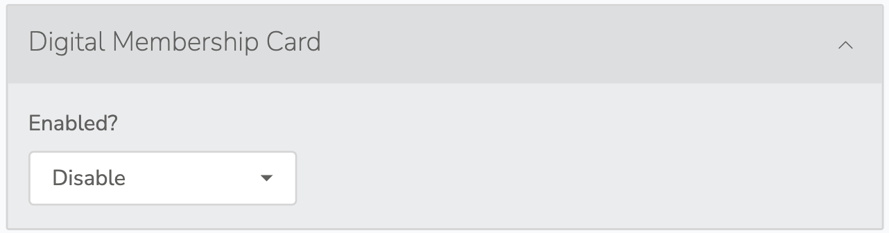
In the Digital Membership Card collapsible, set the "Enabled?" option to Enabled to activate Digital Membership Card functionality. Set the "Enabled?" option to Disabled to activate Digital Membership Card functionality. Forms default to Disabled.
2. Brand Colors
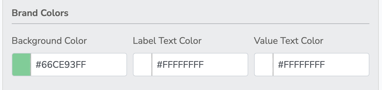
Begin by setting the visual foundation of your digital pass to ensure it matches your organization's brand. Identity the colors using standard Hex codes (e.g., #FFFFFF ).
Background Color
Used for the background color of the digital pass.
Label Text Color
Used for smaller header text.
Value Text Color
Used for primary data).
3. Location-Based Notifications
Engage your members by triggering the pass to appear on their lock screen when they arrive at your venue.
Address Lookup
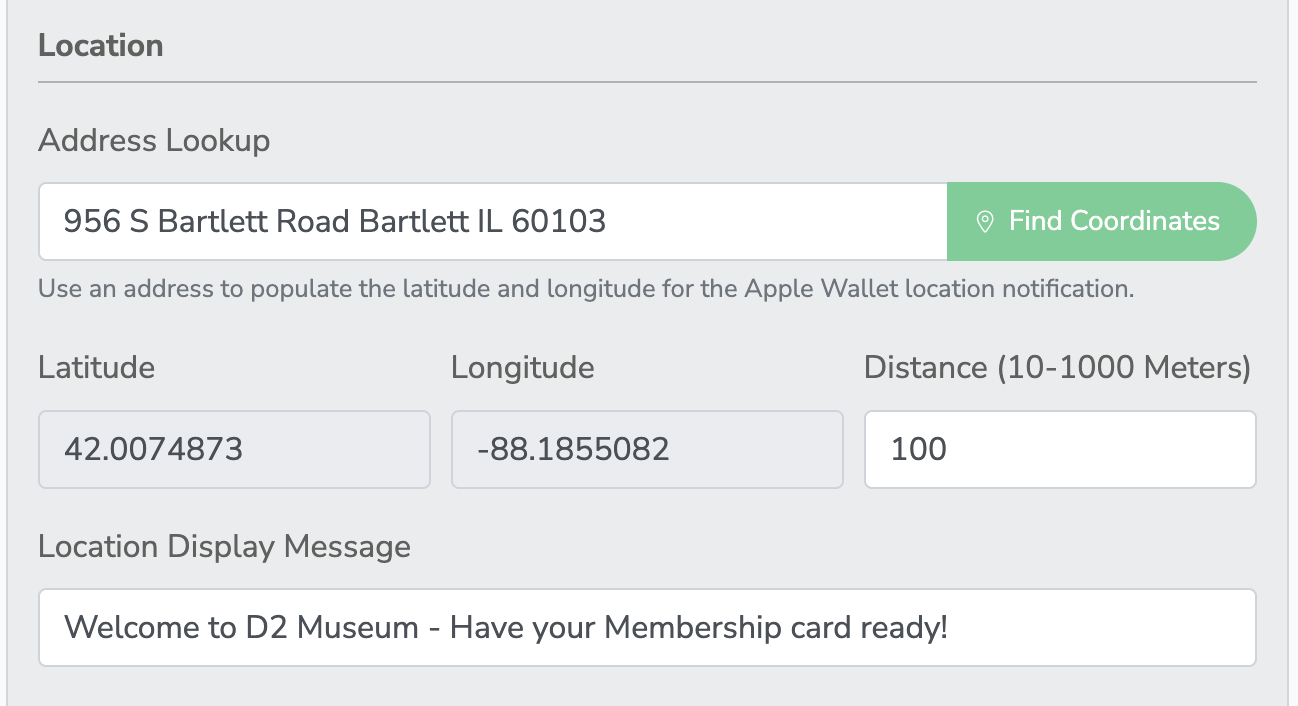
Type your venue's physical address and click Find Coordinates to automatically populate the exact Latitude and Longitude.
Distance (Radius)
Set a custom trigger distance between 10 and 1000 meters. Use smaller numbers (e.g., 50) for tight city blocks, and larger numbers (e.g., 1000) for expansive campuses or gardens.
Display Message
Enter the exact text that will appear on the user's lock screen (e.g., "Welcome to the Museum - Have your card ready for entry!").
4. Text Fields & Layout
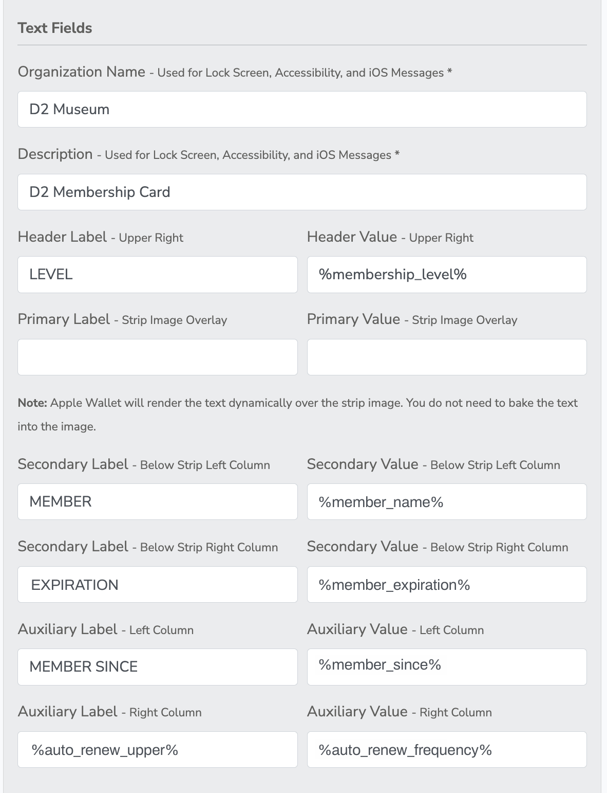
This section determines the text that visually renders on the front of the user's digital card.
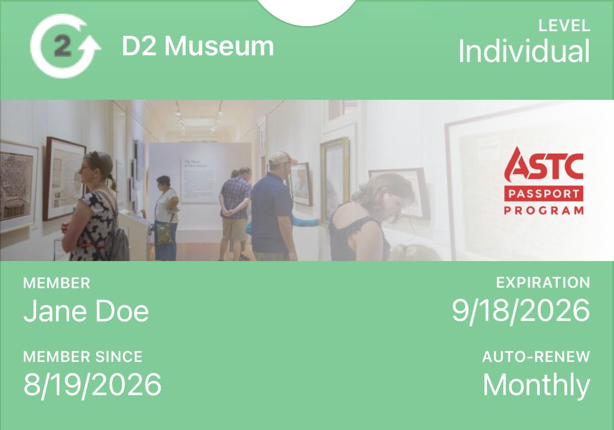
Each of the field types have a Label and a Value.
An example Label = "MEMBER" and an example Value = "Jane Doe"
| Field Type | Placement on Card | Recommended Use |
| Header | Top Right Corner | Membership Level |
| Primary | Overlay on the Strip Image | Not a fan of how this field works |
| Secondary Left | Below Strip Image | Member Name |
| Secondary Right | Below Strip Image | Expiration Date |
| Auxiliary Left | Bottom Row | Member Since |
| Auxiliary Right | Bottom Row | Auto-Renew |
Important Note
The "Organization Name" and "Description" fields do not visually appear on the front of the pass. They are used by Apple iOS for accessibility features (VoiceOver) and default lock screen titles.
| Tokens | Placement on Card | Recommended Use |
| Header | Top rRght Corner | Membership Level |
| Primary | Overlay tn The Strip Image | Not a fan of how this filed works |
| Secondary Left | Below Strip Image | Member Name |
| Secondary Right | Below Strip Image | Expiration Date |
| Auxiliary Left | Bottom Row | Member Since |
| Auxiliary Right | Bottom Row | Auto-Renew |
5. Imagery
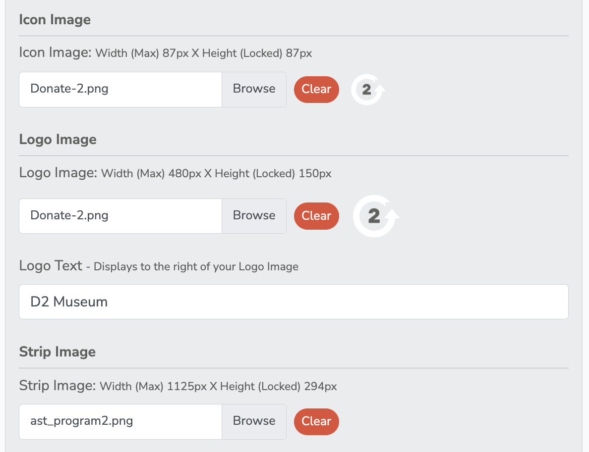
Upload your custom graphics and fill out the informational back of the card.
Icon Image
A small square graphic (max 87x87px) displayed next to lock screen notifications.
Logo Image
Your primary logo appearing in the top left corner (max 480x150px).
Strip Image
The main horizontal banner across the center of the card (max 1125x294px). Your Primary text will dynamically overlay this image.
6. Back Fields
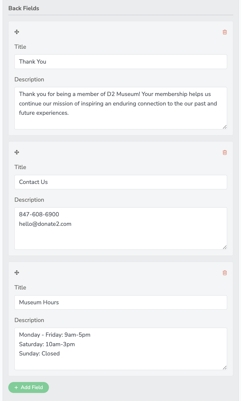
Back Fields: Click + Add Field to include scrollable, long-form text on the reverse side of the pass, such as operating hours, reciprocal benefits, or contact information.